But while Elon Musk has kept the world guessing about why he ditched a name estimated to have billions of dollars worth of brand value, this isn’t the first time a major corporation has undergone a rebranding or a logo redesign. Here are some of the most notable examples of corporate identity transformations in the past decade.
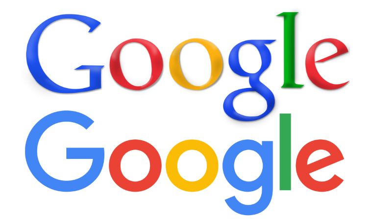
In 2015, Google ditched its rather curvy logo for a more simplified one. “Today we’re introducing a new logo and identity family that reflects this reality and shows you when the Google magic is working for you, even on the tiniest screens,” noted the company in an announcement. The new logo, which features a sans-serif typeface and four primary colours, was designed to be simple, playful, and adaptable to different contexts and devices. The rebrand also introduced a new identity system, including a dynamic mic icon, a colourful dots animation, and a compact letter G.
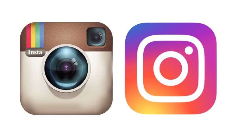 Instagram’s 2016 rebrand was a bold move that sparked mixed reactions from its users. The company purged its iconic retro camera logo for a minimalist gradient design that represented a simplified camera. The new logo was meant to reflect the vibrant and diverse stories that people share on the platform. Some praised the rebrand for being modern and sleek, while others criticised it for being generic and uninspired. The logo has lived into 2023 and continues to hold up well by today’s design standards.
Snapchat
In 2016, Snapchat underwent a major rebranding, with the company changing its name to Snap Inc. and introducing a new product: Spectacles, smart glasses that can record videos and upload them to Snapchat. The rebranding was aimed at expanding Snap’s vision beyond just messaging and for including the Spectacles product under the company name. While the product failed to sell well, the company’s CEO Evan Spiegel more recently hinted toward a future version with generative AI powers.
Meta
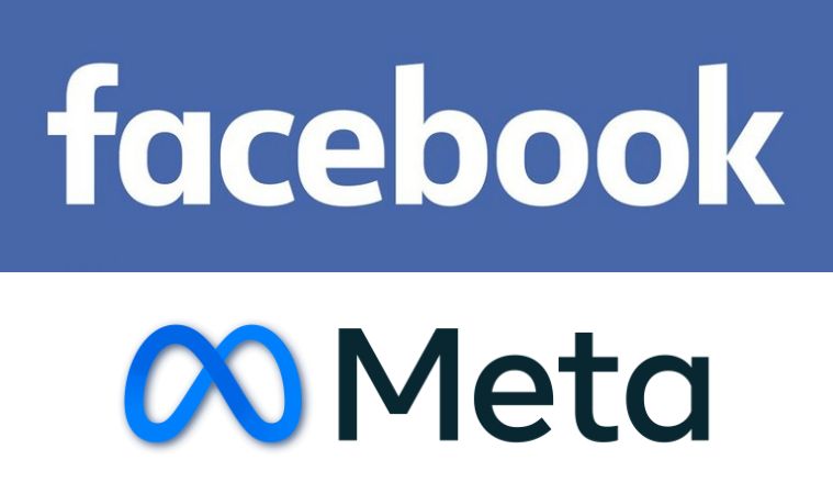 In late 2021, when Facebook was heavily focusing on the Metaverse, the social media company underwent a major rebrand to reflect its vision of building a metaverse – a virtual world where people can interact with each other and digital content. Meta’s CEO Mark Zuckerberg said the metaverse will be “the next chapter for the internet” and “the future of social connection”. While that vision is yet to be realised, the company’s new name – Meta – is now widely recognised. The company also renamed its headset series from Oculus Quest to Meta Quest.
Uber
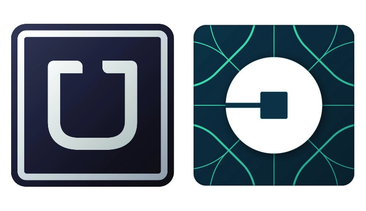
Android

In 2019, Google decided to give Android a fresh new look, with a more accessible and inclusive design. The new Android logo features a more vibrant green colour, mixed with blue and other shades to make it easier to see for colourblind people. The logo also has a curved shape that matches the wordmark and the robot. The new design reflects Android’s evolution and diversity, as well as its commitment to innovation and openness.
For more such content, keep reading @techinnews
